Data Visualization Explained
At Ijiwaru Group, we define data visualization as the practice of visual communication (descriptive statistics). Our primary goal with data visualization is to communicate complex data clearly to a targeted audience using charts, tables, etc. Most common examples of data visualization are bar, pie, tables and other charts. The goal is to make complex data more accessible and usable. Ijiwaru Group uses data visualizations to help clients see linkages in data and use the most appropriate graphic charts to uncover patterns in engaging formats.
In all fields of life, making decisions increasingly relies on data. Today data is almost a torrent that defies comprehension without some kind of synthesis, often visual. One example reported in the open press: The Boeing Company’s Osprey aircraft program faced improving the plane’s takeoff and landing efficiency. Each take off and landing cycle creates a terabyte of data. To put this in perspective, ten cycles create as much data as in the Library of Congress. Finding inefficiencies in all that patterns without visualization would be an almost impossible task.
Today, most people identify data visualization as linked with the dashboard concept. A data dashboard is a management tool that uses graphics to track and analyze specific metrics or data points. In business contexts, dashboards help answer specific questions from departments or entities to track operations from multiple data sources usually in real time.
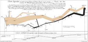
 Data visualizations encompass more than dashboards. Charles Joesph Minard’s 1869 diagram of Napoleon’s invasion of Russia possibly is the best statistical graphic ever made. Minard plotted six different variables that are immediately grasped upon viewing. Contemporary data visualizations often focus on the technology of graphics presentation over the actual data. The best use of graphics is to reveal data. Minard demonstrates that powerful ideas presented elegantly are enduring.
We believe data visualizations fall into four distinct concepts: illuminating ideas, creating ideas, visual exploration, and the dashboard type projects above. Each has its own demands for data input, organization, presentation and communication purpose. We well help you discover which is right for your needs.
Data visualization increasingly can be an important international communication tool. Although Asia, North America and Europe dominate Internet today, usage in the Middle East, Africa and Latina America is growing by 400% a year. English and Chinese languages each represent 30% of Internet usage with Spanish, Japanese, German, French, Korean and Arabic following. Clear, visual and often non-verbal communications can be critically important.
Why Do You Need Data Visualization From Ijiwaru Group?
We empower our customers to use our data visualization services to visualize their data for use and communication. Our data visualization services begin with deep immersion in a client’s existing data and collective relevant new data. Through an interactive design and communication cycle, we work with customers to reach a final stage product that can range from communications plans, interactive products, dashboards, interactive apps (for mobile use or on the web), etc.
Ijiwaru Group has been mastering the craft of data visualization for many years. We help clients understand their internal complex data and construct a visualization product that embodies both the client’s data and their communication goals.
Learn more how Ijiwaru Group can help you today.
